Schiphol Airport

Simplyfing the user flow of the mobile app for travelers at Schiphol Airport

project

Summary

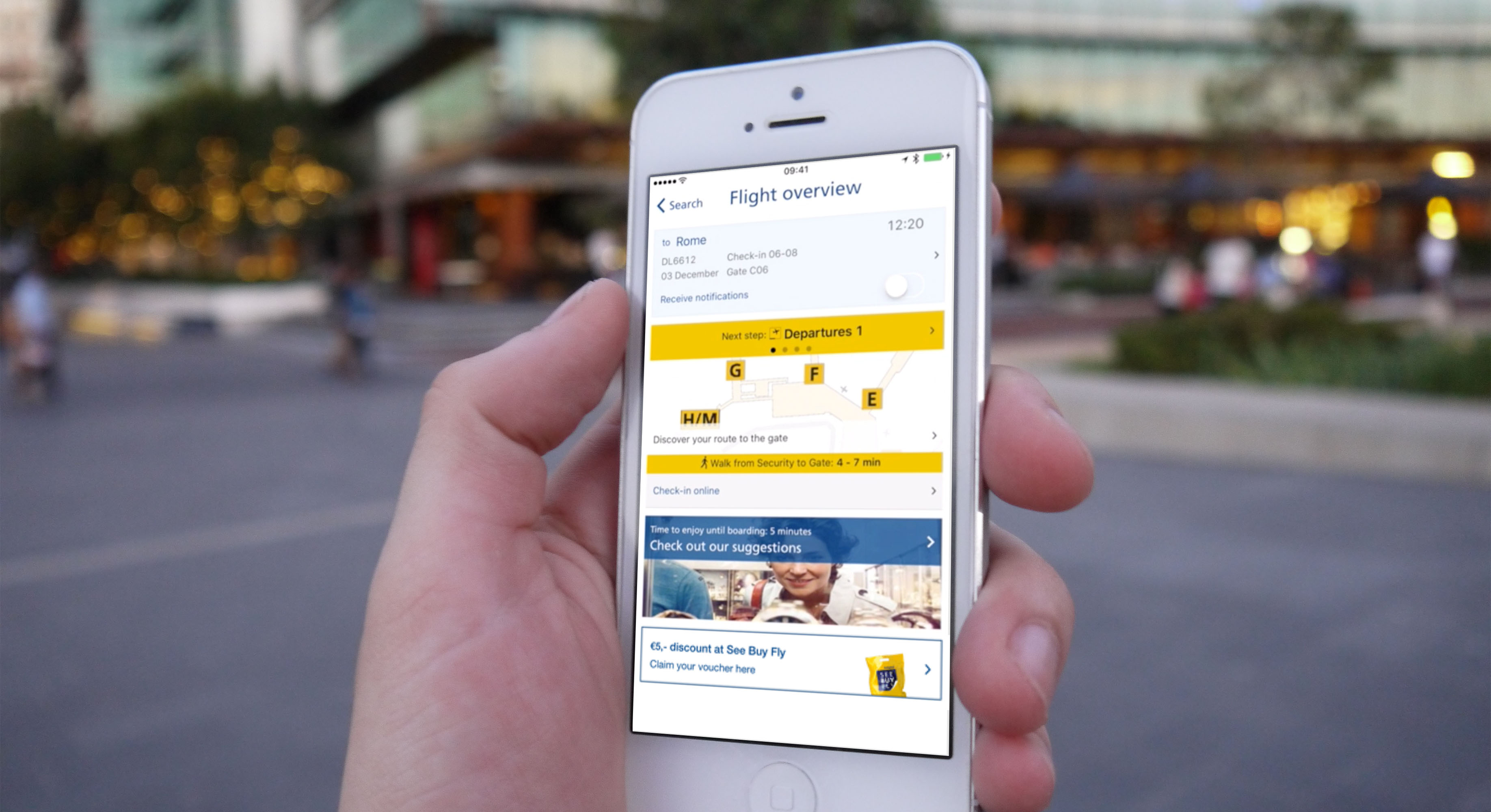
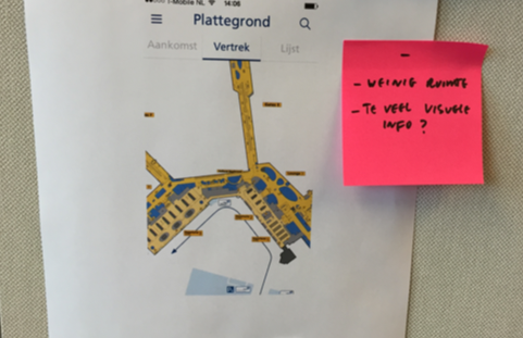
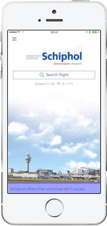
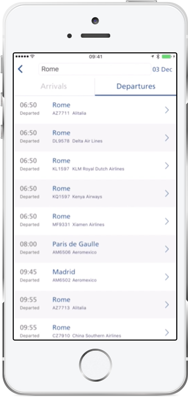
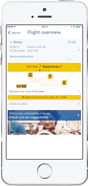
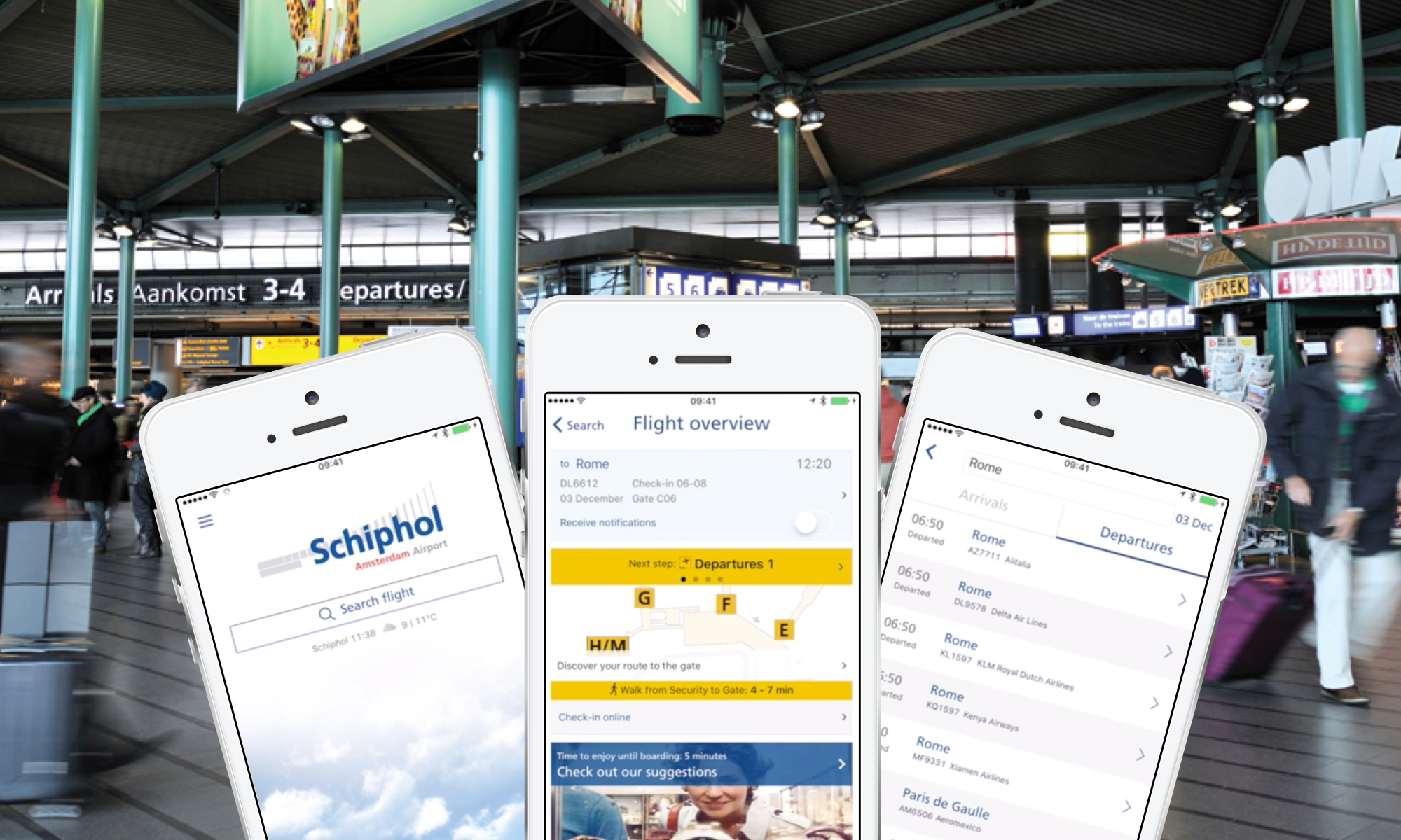
​Flying is for a lot of people a stressful undertaking. The journey from/to the airport, queues at the check-in desks, security, a last minute gate change; it can be stressful. The Schiphol mobile app guides the user trough this process to make flying a less stressfull experience.

The goal

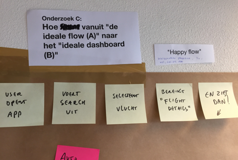
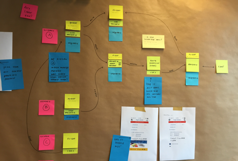
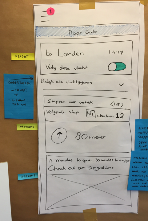
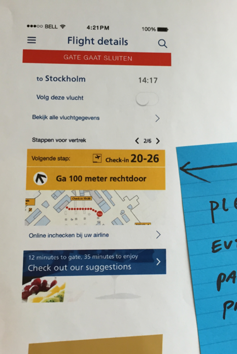
​During my time employed at M2mobi, we were asked to simplify the user flow of the Schiphol Airport mobile app to help the user experience less stress while traveling to and trough the airport.

My role

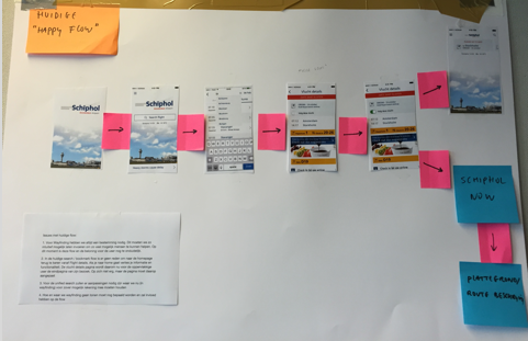
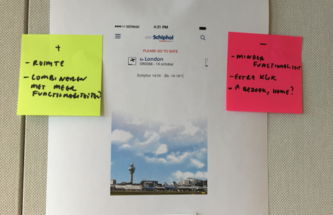
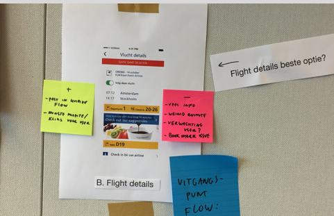
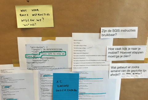
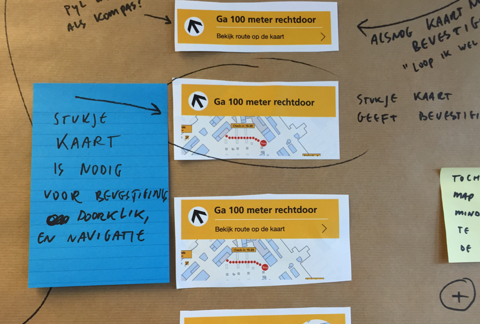
Our team consisted of 3 people. Me, Another UX designer and a Creative Director. Within this project I was involved in almost all steps of the process: ideation, information architecture, wireframing and prototyping.

Timeframe

​2016

Client

Schiphol

Team

1 ux designer
1 Creative director

project

The challenge

How might we improve the user flow of Schiphol Airport app users to experience less stress while traveling?

In the years that M2mobi worked on the Schiphol app a lot of functionalities were added to support the travel experience of the user. One of the projects I worked on myself was Schiphol Parking. Besides that there was a lot of other functionality in the app such as: taxi reservation, Schiphol Now (shopping), Search flights, Flight details, indoor wayfinding, Buss and train information, Customs information and user accounts.

The app became bloated, because of all the functionality we added over the years, was just stacked in a hamburger menu. To find a solution for this problem we started a design sprint of a week to come up with new ideas to improve the user flow and make the app less bloated

Initial research

What are the problems with the current user flow?

To understand how we could improve the user flow, we first needed to do research into the current user flow to identify the pain points. We started with creating a map of the current primary user flow to look for potential pain points or problems a user can have navigating trough the app.

project
project
project
project

We identified multiple points to improve upon in the current user flow. We found that the:

  1. Homescreen was not functional enough. Users had to go to the flight detail page for all information they need, this takes an extra click.
  2. There was a lot of space unused on the homescreen which could be used to show important information
  3. Flight detail page was too cramped with a loads of information and functionality
  4. A lot of functionality on the flight detail page was not relevant when the user is at the airport or at home
  5. Indoor wayfinding had a lot of visual information and when using hides other important flight information. When the flight status changes it will be hidden.
  6. Indoor wayfinding was not accessible from the flight detail screen.

Based on our findings, we hypothesised that the homesceen needed to be redesigned to simplify the user flow, because it lacked functionality and relevant information. Instead, the current flight detail screen should become the homescreen because there was all the information the user needed, and from there we could guide the user to the rest of the functionalities in the app when relevant.

We started looking at the flight detail screen to see what information and functionality is minimal needed for the user and what functionality is secondair.

project
project

Insights

What information is relevent and when is it relevant?

After we got a good understanding of what functionality and information is important to show to the user we started brainstorming what functionality is relevant and when. Because relevance can differ based on the physical context and time we created a map with different points in time working up to going to checking in at the gate.

project

Initial solution

Context is key

The map we made based on context and time, showed us that the user’s location data can be very interesting to use to show and hide certain functionality to improve relevance. We already had access to the GPS location of the user, bluetooth and Wifi which we use for Indoor wayfinding. Parking reservation, bus, taxi or train information is relevant when the user is not at the airport yet, but on the airport it is not that relevant anymore, while indoor wayfinding, the current flight status and shopping will.

Sketching initial solutions

The next step we took was to sketch out the new user flow, which functionalites to show and when, and how the new homescreen should look like.

project
project
project
project

While we were sketching out the new user flow new design questions came up.

  • How to get to the full flight details?
  • How to navigate to this screen?
  • How do we solve the bookmark problem?
  • What map should we show the user?
  • How do we show the steps the user has to take and how can he navigate trough those steps?
  • How do we show the steps the user has to take and how can he navigate trough those steps?
  • How do we show the indoor way finding instructions?

Based on technical feasibility we explored the different solutions and sketched out the user flows. Then we discussed and decided the most feasible solution for this new user flow using a "dot vote" method with different stakeholders from relevant Schiphol departments.

project
project

Prototyping and testing

We started prototyping based on the sketches of the new flow identified. We created a mid-fidelity prototype with Proto.io to evaluate on that. We recruited a total of 5 participants at Schiphol Airport who had used the Schiphol app already. Sessions were conducted at Schiphol Airport Plaza and each session lasted around 20 minutes.

project
project
project

Our goals for the testing were to:

  1. Find if Is the new user flow an improvement over the current user flow.
  2. Test the usability of the new interactions.

Based on our findings during the usability test, we found that the new user flow was an improvement to the app. During the usability test it was not possible to know if people experience less stress while traveling trough the airport, But our participants liked the new user flow.

Results

After making design improvements, working out all the secondary flows, information acrhitecture and design documents, we launched the new user flow a couple of months later. Below are some user reviews we found in the app store.

“App is faster and clearer after redesign! Finally a useful app that adds something.”

“Super app! also works perfectly on my iPhone 6. Handy for checking flights quickly. Compliments for the designers”

“Used this app for the first time. A very handy app. If you have added your flight, you will be warned if there are changes. Gradually I discovered more and more in the app, for example a map of Schiphol with the walking route and time to the gate.”

Kubbs AR
Gibble